The use of Paper Cut and Shadows in Graphic Design
Paper can be cut, folded and used in interesting ways to create graphic design pieces.
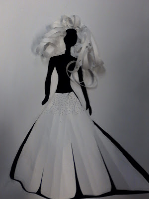
I created this quick silhouette of a bride using just a single sheet of paper.
The result was quite striking and could easily be incorporated into a piece of design.
I created this quick silhouette of a bride using just a single sheet of paper.
The result was quite striking and could easily be incorporated into a piece of design.
The Secret Garden
Shadows can also be used in graphic design to create depth and interest.
I set about designing a book cover for 'The Secret Garden' using shadows.
First I gathered my inspiration from existing book covers and shadow typography.
I thought it would work well to write the title of the book in a shadow.
I also liked the idea of featuring a key in my design. After looking at pictures of keys I realised I could incorporate the typography in the key design and cast a shadow of it.
I created the design on the computer, printed it out on card and then cut around my key using a craft knife. (see below)
The shadow of the key came out very clear and the text was legible. My images were very dark but I was not too concerned at I knew I would be able to brighten them up in Photoshop.
These were some of my initial idea developments.
This was created using one of my shadow photos and some garden photography.
I used the overlay blending mode in photoshop to merge the two images together.
I wasn't very pleased with the outcome as there wasn't enough contrast between the key
and the background image.
I created this design from the shadow photography, by simply adjusting the hue and saturation in photoshop. I chose green to reflect the idea of a garden. I like the typography in this design but I felt that the design was a little flat and was lacking something.
I then created this design using the key to cast a shadow against an image of a door.
The door imagery works well with the key, helping to tell the story. The image of the hand also gives more meaning to the image and works better than having the key floating on the page. I was not completely happy with the design, in particularly the typography at the bottom and also the lack on contrast between the key and background.
This was my final book cover design, which I was pleased with. The image is bold and striking and the white background gives the book a modern and fresh feel. The cover is quite unique from others which have been designed in the past for 'The Secret Garden'. My only concern with my design is whether it is suited to a children's book because it has a mature feel to it.


