Friday 29 January 2016

Over the Moon logo

Over the Moon logo concepts

In our group project we decided to all work on logo concepts for 'Over the Moon'.
Here are the logo concepts I came up with.


Logo development


Thursday 21 January 2016

Kerpow Print Campaign

Images from print campaign

I came across these stock images of children and thought they would be really good for my Kerpow print campaign as they fitted in with the superhero theme. I thought I might use them for my print campaign or website.


Wednesday 20 January 2016

Website Inspiration for the Kerpow brand

Research for Kerpow's website

In order to create my website homepage I first researched my competitors websites, Fruit Shoot and Innocent Smoothies.   Both websites were colourful and featured nice photography of the product and also happy faces. I preferred the Innocent website as it had more white space and was cleaner and simpler. I wanted to create a similar simple website.


I also looked at the Cebeebies website which is popular with children. I wanted to create a website that would be fun and appealing for children to use too.
The Cebeebies website has a lots of games and activities on it for children to play. I would like to create a game within my website to attract children to my website.
Inspiration for  a Game

When considering how I might design a game within my website I had a look at other popular children's games, for example Angry Birds. I wanted to look at the style of the graphics within the games. I noticed that the games feature simple illustrations and lots of bold block colour.


Developing brand characters

Brand Character Development

I came up with some names for my superheroes and corresponding drinks flavours;
Thunder Heart - Blueberry and Beetroot
Metal Titan - Pineapple and Parsnip
Invincible slime - Kiwi and Spinach
Hawk Eye - Carrot and Orange
Fire Cat - Strawberry and cucumber

I also looked at existing superhero artwork to get ideas.


I particularly liked the simplicity of the bottom two illustration styles.
I want my illustrations to be friendly and appealing to children.


Here are the superhero characters that I created.


Brand development

Vegetable Drink Research and Development


When considering the direction to go with my brand design I was inspired by this Matey bubble bath packaging. I thought that I could create characters for my packaging that would appeal to children.


These superhero bottle designs also inspired me. I decided that I would design my packaging with a superhero theme.

Ideas and inspiration

I began to research other superhero themed work to get inspiration for my own work.
Here are some that I liked.


I like the use of bold primary colours and typical comic book shapes.
I may also incorporate some dotted patterns in my work too.


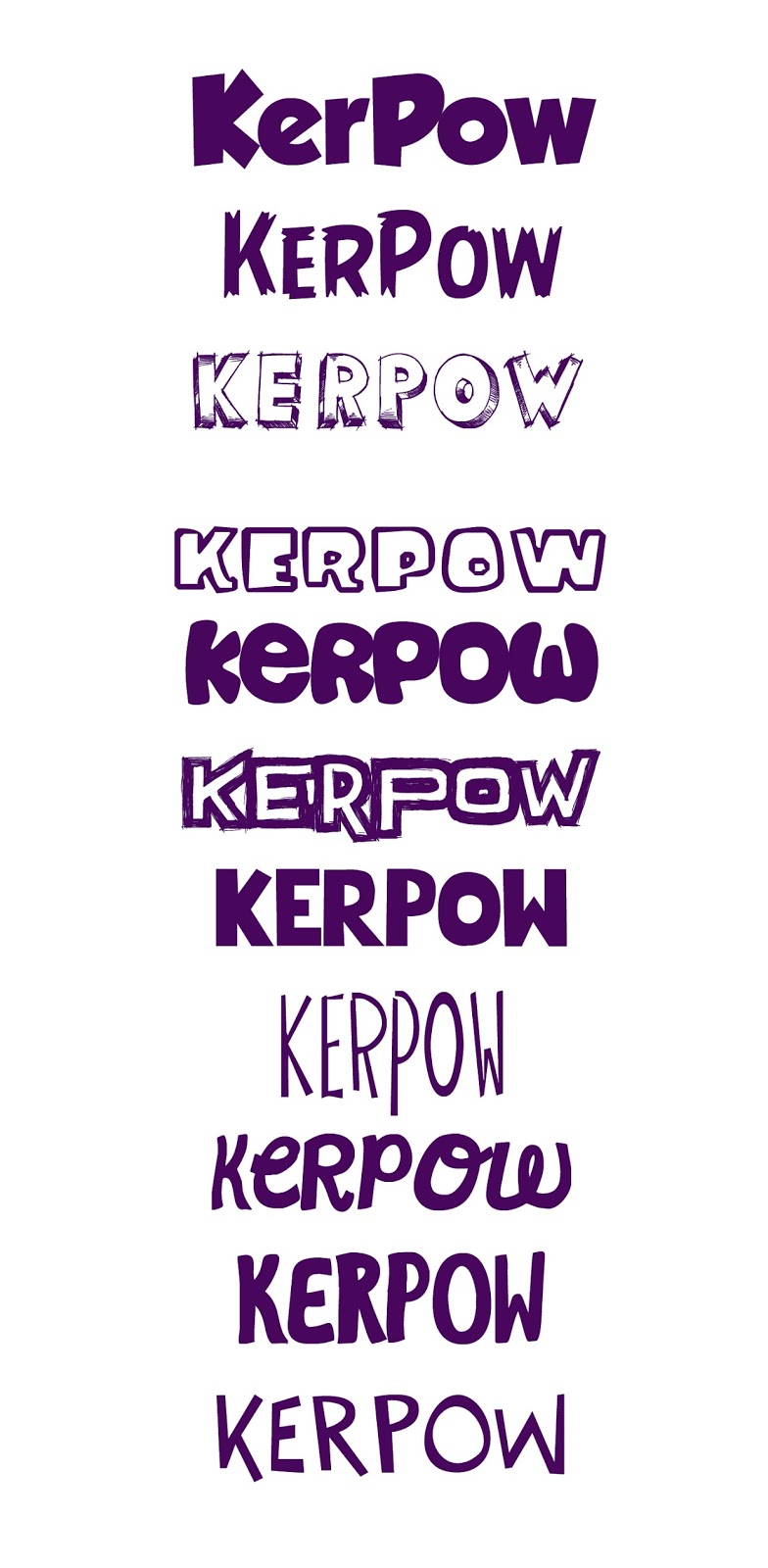
Typography Experiments

I decided on the name Kerpow for my brand. I chose the name because the word is a phase used in cartoons, meaning 'a powerful sound of impact or transformation; pow, wham.'
It seemed appropriate for a superhero theme.

These are some of the different font options I considered for my logo.

I also experimented with logo variations, fonts, colours, backgrounds, etc.


I was happy with my final purple logo and thought that the logo could also work without the background.