Showing posts with label Branding. Show all posts

Thursday, 21 January 2016

Kerpow Print Campaign

Images from print campaign

I came across these stock images of children and thought they would be really good for my Kerpow print campaign as they fitted in with the superhero theme. I thought I might use them for my print campaign or website.


Wednesday, 20 January 2016

Website Inspiration for the Kerpow brand

Research for Kerpow's website

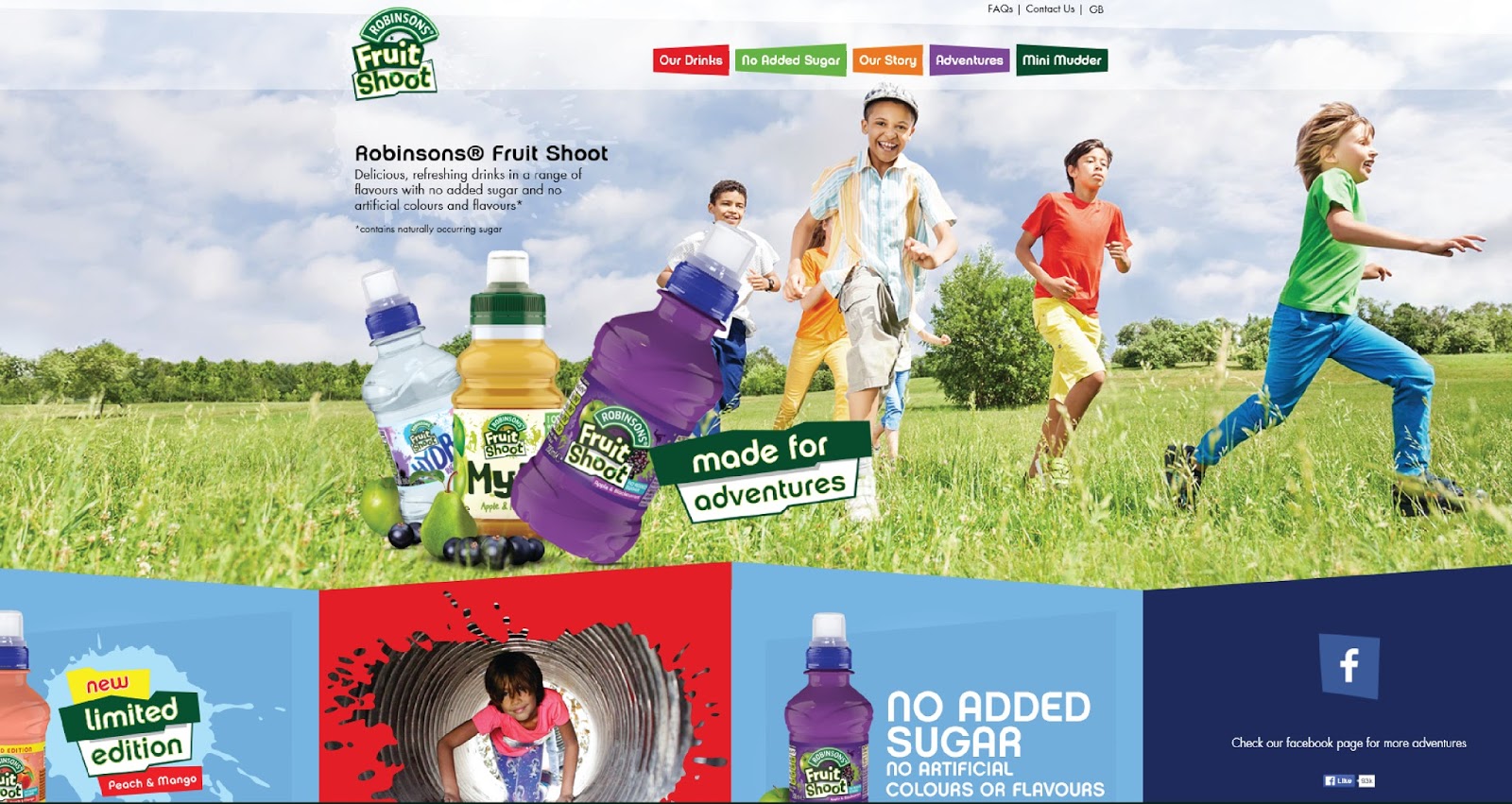
In order to create my website homepage I first researched my competitors websites, Fruit Shoot and Innocent Smoothies.   Both websites were colourful and featured nice photography of the product and also happy faces. I preferred the Innocent website as it had more white space and was cleaner and simpler. I wanted to create a similar simple website.


I also looked at the Cebeebies website which is popular with children. I wanted to create a website that would be fun and appealing for children to use too.
The Cebeebies website has a lots of games and activities on it for children to play. I would like to create a game within my website to attract children to my website.
Inspiration for  a Game

When considering how I might design a game within my website I had a look at other popular children's games, for example Angry Birds. I wanted to look at the style of the graphics within the games. I noticed that the games feature simple illustrations and lots of bold block colour.


Developing brand characters

Brand Character Development

I came up with some names for my superheroes and corresponding drinks flavours;
Thunder Heart - Blueberry and Beetroot
Metal Titan - Pineapple and Parsnip
Invincible slime - Kiwi and Spinach
Hawk Eye - Carrot and Orange
Fire Cat - Strawberry and cucumber

I also looked at existing superhero artwork to get ideas.


I particularly liked the simplicity of the bottom two illustration styles.
I want my illustrations to be friendly and appealing to children.


Here are the superhero characters that I created.


Brand development

Vegetable Drink Research and Development


When considering the direction to go with my brand design I was inspired by this Matey bubble bath packaging. I thought that I could create characters for my packaging that would appeal to children.


These superhero bottle designs also inspired me. I decided that I would design my packaging with a superhero theme.

Ideas and inspiration

I began to research other superhero themed work to get inspiration for my own work.
Here are some that I liked.


I like the use of bold primary colours and typical comic book shapes.
I may also incorporate some dotted patterns in my work too.


Typography Experiments

I decided on the name Kerpow for my brand. I chose the name because the word is a phase used in cartoons, meaning 'a powerful sound of impact or transformation; pow, wham.'
It seemed appropriate for a superhero theme.

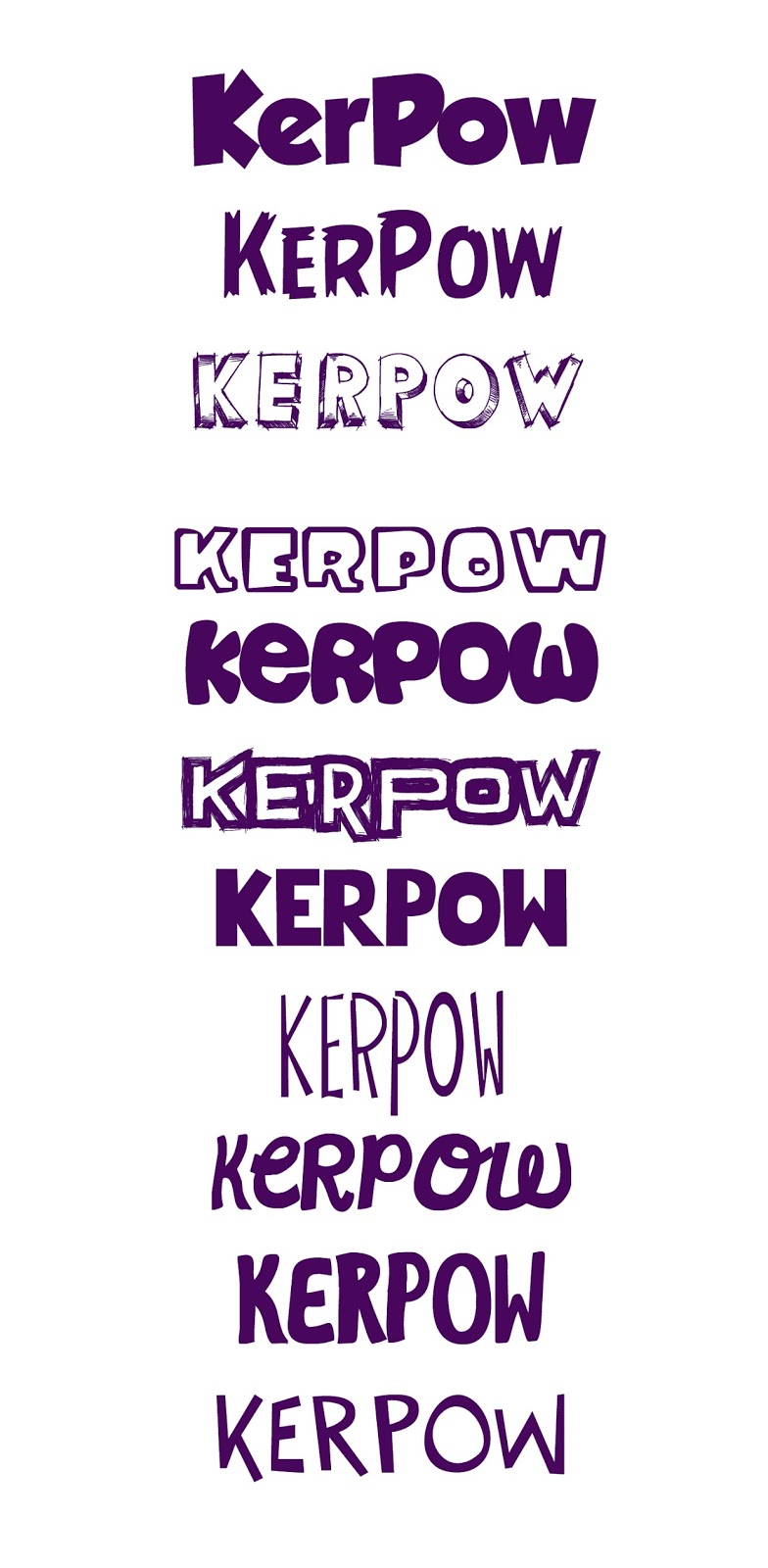
These are some of the different font options I considered for my logo.

I also experimented with logo variations, fonts, colours, backgrounds, etc.


I was happy with my final purple logo and thought that the logo could also work without the background.


Tuesday, 24 November 2015

Branding Swat Analysis

SWOT Analysis for my brand of healthy drink

STRENGTHS
  • Appealing packaging makes us strand out from our competitors 
  • Marketing plan to target children
  • There is a gap in the market for a product like this, that is healthy and appealing to children
  • The nutritional benefits of my product are easy to market to parents
  • Lower price point than high end competitors (e.g. Innocent)
WEAKNESSES
  • Shorter shelf life of fresh fruit drinks, storage in fridge may be necessary
  • Not able to compete in price with those offering lower quality drinks that don't contain real fruit
  • Having to market the idea that vegetable drinks would taste good
  • Market research was on a small scale so results may not be accurate.
  • My target market is limited to parents
Opportunities

  • Opportunities to partner with other businesses who may stock my product, for example coffee shops and super markets.
  • Government initiates to promote healthy eating among children will help my campaign.
  • My competitors weaknesses, for example the uninspiring packaging design
Threats

  • Threat from Innocent smoothies who have recently launched a vegetable drink.
  • Negative publicity
  • Competitors developing more better packaging for their drinks
  • Competitors, like Fruit Shoot and Capri Sun more affordable to working class parents. them my product

Wednesday, 11 November 2015

Branding Inspiration

Branding Inspiration

For my children's drinks product, I had a look at existing children's packaging for inspiration.
These were some of the designs that grabbed my attention.

Mergendage Szörpök by Matyas Szabo, via Behance: your daily #packaging smile : ) PD: These funny collectible juice packaging were developed with all our affection for children, 'les petits'. With tetra pack packaging that retain more natural juices, all packages have been designed in a sustainable use, with papers and returnable bottles.:
ingela p. arrhenius #Illustration: Jaw Drop Cooler:

I like the idea of creating character themed packaging.

Creating a healthy children's drink brand

Creating a healthy children's drink

Target market
I decided that for my project I wanted to create a healthy drink for children. Being a parent myself it concerned me about the amount of sugar contained within many drinks aimed at children.  I felt that this was a definite market to be targeted. My drink brand would need to appeal to children and parents.  My primary audience would be the parents of young children (as they are the ones who are usually buying the drinks), followed by children themselves as my secondary market, who may buy the drinks with their pocket money.

Competitors
My main brand competitors are: 
-Ribena
-Fruit shoot
-Capri Sun
-Innocent Smoothies
One of the areas that is of particular interest to me is packaging that will appeal to children. I feel that many of the drinks aimed at children have quite uninspiring packaging. I believe that if I were to create packaging that would really grab a child's imagination, I would go a long way in producing a successful brand and it would give me an edge against my competitors.


I had a few ideas that came to my mind concerning this brief.

1) My first idea was a healthy jelly based drink. I know that most kids love jelly and the pre-packed jelly market is one that has really taken off lately. I felt that it would be a fun unique product that kids would love. I found that there is a jelly drink already on the market, however I know that it is not a widely known brand, so I felt there is still a gap in the market.


packshot

2) My second idea was a healthy hot drink. The idea behind this is children love being 'grown up' and having what the adults are drinking, for example tea. Parents are not keen on their children drinking tea because of the caffine, but it is a lot healthier than many of the sugary drinks on the market. My idea was to create a drink like tea for children, that would be appealing to children's tastes, it would be caffine free and be something that parents would feel happy buying.

3) My third idea was a vegetable based drink. Most parents struggle to get their children to eat vegetables and my idea was to create a product that would contain hidden vegetables mixed with fruit juice. The product would be 100% fruit and vegetable. Examples of flavours could include 'beetroot and blueberry' 'yellow pepper and orange', 'Kiwi and spinach'.  When vegetables are juiced with fruits they take on the sweetness of the fruit so they would be pleasant to drink. This concept would appeal to parents but if packaged in a really inspiring way, would appeal to children too. After researching further I discovered that Innocent Smoothies have also recently launched some drinks containing vegetables. However Innocent Smoothies seem to be appealing to adults more than children in their packaging design. 


4) My fourth idea was to re-brand water. Everyone knows that water is the healthiest drink of all however kids don't always want to drink it. I had the idea of re-branding water in an interesting way that would grab children's attention.  I could possibly add some natural flavours or colouring to water to make it more appealing to children.

Market Research

I decided that the best way forward for this project would be to carry out some market research to find out what my target market think about my ideas.  I created a survey to find out more about my target market and also to get feedback from them about my ideas.

This was the survey I created for parents of children under age 14.


I shared my survey with friends via email, on social media and also in twitter.

Results of Market Research

To date I have had 22 parents complete my survey. Most of these parents had children between the age of 3 and 8.

These were the findings.

1. Water was the drink that these children drank most regularly, followed by Squash.
2. Fruit Shoot was the most popular bottled drink
3. Innocent Smoothies were considered to be the healthiest drink
4. 80% of parents felt that there was a need for a healthy children's drink on the market.
5. The three most important factors for parents when choosing a drink for their children are firstly, nutritional benefits, followed by price, followed by their children asking them to buy it.
6. Nearly 70% of parents said their children ate 5 portions of fruit or vegetables every day.
7. 67% of parents liked my idea of re-branding water, and 48% liked my idea of creating a vegetable based drink.


Here are some other comments from parents...

Whole fruit smoothies with additional healthy ingredients such as flaxseed, sprulina, spinach, etc. For hot drink options, things like peppermint and green tea with natural vanilla or honey to eliminate need for refined sugar or artificial sweeteners. Also naturally caffeine free teas would be a good option for kids. Chai teas aimed at kids would be good (loose leaf assam tea, cardamom pods, cinnamon, fennel, etc) with whole organic milk and honey - would be the healthier option to things like hot chocolate, horlicks or even nesquick... Soft drinks made from fruit juice (not from concentrate) and sparkling water. This would taste good and eliminate the need for artificial sweeteners or added sugar.

Having a child with type 1 diabetes means drinks must be sugar free, but I also don't like them having fizzy or too many artificial sweeteners so drink options are very limited...is water our only healthy option??

Hot drinks for children is not a safe concept and hence difficult to market

Natural sugars rather than sweeteners

Most parents seem to be against artificial sweeteners and also the comment about the safety issue of marking hot drinks to children is a big consideration for me.

Based on my research I will either go down the route of designing a vegetable based drink or a water drink for children.

One idea for a name for a vegetable drink was 'VEG HEADS'. The bottle lids could be made up of different character heads which children could collect.  The other idea was to create some kind of  product that could be added to water (like squash), to improve the taste of water. It could be healthier than squash and could be packaged in individual pouches, which could be handy when out and about.
One idea for the name I had was 'POWER-UP' pouch.
I will investigate these brand ideas further.


My brand values

My brand need to be..
Healthy
Fun
Happy
Exuberant
Honest
Friendly
Environmentally friendly
Sensitive/ understanding of parents
 Good value
Trustworthy
Contemporary
Natural
Organic
Pure
Unique
Youthful
Nutritious
Playful
Original
Practical
Knowledeable
Powerful
Adventurous
Dynamic
Memorable

My three most important values are

Natural, Fun, Value

My most important value is FUN.


The personality of my brand
If my brand had a character he would be superman.
If my brand went on holiday, it would go to the moon.
If my brand were a colour it would be purple and green.
If my brand were age he would be a young boy.
If my brand were a job it would be a scientist.
If my brand lived in a house it would live in a city skyscraper.
If my brand drove a car it would be beetle.
If my brand were an animal it would be a lizard or Geko.
If my brand were a country it would be America.
If my brand were a book it would be a comic.
If my brand was a piece of clothing, it would be a t-shirt.
If my brand were an art movement it would be pop art.
If my brand were a style of music it would be pop music.
If my brand were a film it would be an action film.
If my brand were a sport it would be mountain climbing.




Saturday, 31 October 2015

Logo Design

Logo Design

I was asked to design a logo for a company called Tricord Films.
These were the initail ideas I came up with.


Following a discussion with the client, these were the revised logo designs.


This was the final design that was chosen and how the logo would look in different situations.


Wednesday, 14 October 2015

Google's New Logo

Google's New Logo


An analysis of Google’s new logo

This year google revealed their new logo, 18 years after they launched in 19
98.


Why is the timing now?

The timing of the new logo launch is interesting as it not only ties in with their 18th Birthday but also a major restructuring within the company and the creation of the holding company known as ‘Alphabet’, positioning Google as a smaller part of something larger. The google logo now also bears more resemblance to its new parent company.


How does the redesign compare with the previous logo?

The new logo has retained some common features with their old logo, namely the iconic colour scheme, the general proportions of the typeface, the same arrangement of uppercase and lowercase lettering and the playful letter ‘e’.  It retains its simple, friendly and approachable style. The most noticeable change is the move away from a serif typeface to a sans serif.  The colours are also very slightly softer.  The new font used by google bears resemblance to other commonly used sans serif fonts with only minor alterations.


The new branding contains three design elements, the words ‘Google’, the Google dots and the Google ‘G’.  These variations allow the branding to work across different platforms, like business cards, websites, smartphones, TV, tablets, etc.  The new logo has been designed to work on a very large scale and also when reduced to a tiny size.  Google felt that it was necessary to re-brand in order to reflect the reality that Google is no longer just a site that you visit on a desktop computer.  The logo also displays better on low bandwidth connections in different parts of the world.


Does it work?

The new logo is remarkably simple and has even been referred to as dull, however it serves the purpose for which it was created to work on different devises.  In my opinion it was wise of Google to not move too far away from their original logo which was already so representative of the company.  This was a safe approach to take and their goal has been accomplished in creating a logo that works well across all devises.  The new letter ‘G’ and google dots are very clever as they give the logo more scope to appear on a wider range of products.


Saturday, 10 October 2015

Rebranding Exercise for TKMAXX

Rebranding a High Street Store
 
 
We were given the task to rebrand a high street store. I felt that TKMAXX could do with a rebrand. The current logo is not very contemporary and the store isn't very appealing to a fashion conscious younger generation. The existing brand image makes you think of sales, which is probably intentional. However I feel that this approach puts some potential customers off as they see the store as being cheap and tacky. 
This is the existing TK Maxx logo.
These were my ideas.
 
 I felt that this design was the strongest of all of them.
I feel that the logo is classier than the existing logo.