Alcohol Packaging Research
During half term I visited the alcohol department in the Selfridges store in London for inspiration for my project.
These were some of the packaging designs that I liked.

Most of the wine packaging was simple and classic, often with simple black and white illustrations
on white labels. I particularly liked the torn label on one bottle (top right).
on white labels. I particularly liked the torn label on one bottle (top right).

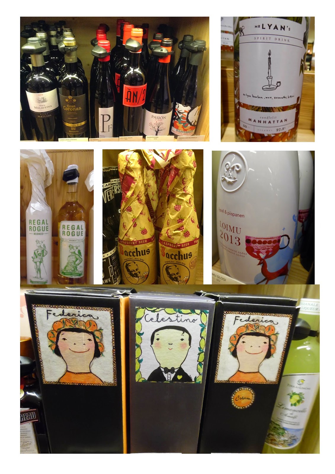
Some of the wine and champagne were presented in lovely boxes or paper packaging.
I liked the luxurious foil and embossed textures on the boxes.
I liked the luxurious foil and embossed textures on the boxes.

I noticed that some of the spirit drinks had really decorate attractive designs on the bottles,
often illustrative in style. For my project, I may create packaging for a spirit.

These images of alcohol bottles were from the internet. I love the bright colours and
also the way the designs work across a range of flavors or varieties.
No comments:
Post a Comment