Showing posts with label Type and Image. Show all posts

Thursday, 7 May 2015

Malibu packaging development

Malibu Packaging Development
 
 
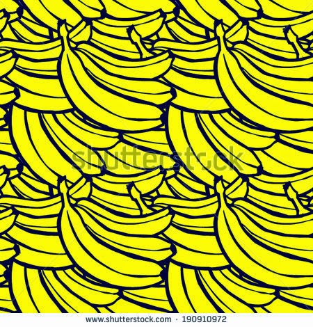
Having created the patterns using the Mono Printing technique I began to think about how this design could work for a range of drinks flavours. I decided to adapt my pattern, so rather than including all the fruit on it,
I decided to create a different pattern for each drink and use different colours for each fruit. I am happy with the result and then had a go at seeing how my pattern would look with the Malibu writing on it.
I will experiment with other typography and create patterns for the other fruits.


Packaging inspiration and idea development


Inspiration from other Designers
 
 
I stumbled across this book called 'The Neon Colouring Book' and found the illustrations in it to be very inspiring and similar in some ways to the simple Mono Prints Patterns I have created.
I like the combination of black and white illustrations with splashes of very bright bold neon colours.
I like the bold colour choice and hope to incorporate this in my packaging.
 

Here is my own experiment in combining my black and white illustrations with very bold block colour.
I like the outcome.


Monday, 4 May 2015

Mono Print Malibu Pattern
 
 
I decided to experiment with the mono prints that I created the other day to make this pattern in photoshop.
I am quite pleased with the outcome and may use it for my alcohol packaging and develop the idea further.


Friday, 1 May 2015

Mono printing

Mono printing

In our lesson we tried mono printing. We applied oil paint to an acetate sheet. We then put our printing paper over the top and then another sheet on top with our design on. We traced the design with a pencil, which then pressed into the ink and printed on the paper. These were the prints that I created below. I liked how the drawings came out and I may use them in my design.


 I then had a go at using the prints to see how I could incorporate them into my alcohol packaging . In photoshop I changed the colours of the print into white and then added some coloured circles to create a pattern. I am not very keen on the final outcome, so I will continue to experiment with how I might use my prints. 


Monday, 30 March 2015

Malibu Packaging Experiments

In our lesson today we worked on collage techniques in Photoshop.
I created this design which may be suitable for my Malibu packaging.


I began by creating overlapping leaf shapes on a layer and used the multiply effect to separate the shapes out into sections. Once I had my shapes, I used different imported textures to fill in sections of my shapes. I adjusted the colours by desaturating the shapes and adjusting the hue and saturation. I added the flower and coconut shapes (black vector shapes) and filled them in with different textures. I added a watercolour background. I am quite happy with the outcome and think the concept could work in the other Malibu flavour ranges.


 I then thought about whether this technique could be used to create a background pattern for my bottle. 
Here is the pattern I created. 


Tuesday, 24 March 2015

University Leaflet

We were given the task of creating a leaflet to advertise a new course at Farnborough University.
We were given the content, including fonts, images, logo and colour scheme to use.
I began by cropping around the edge of my photo using Photoshop and then creating the layout using Indesign.
Here is the outcome.


Tuesday, 17 March 2015

Watercolour Patterns

Watercolour Patterns for Malibu Label

Following on from the watercolour fruit paintings that I created the other day, I decided to use them to create patterns using the 'define pattern' option in Photoshop.  I had to brighten up the colours in Photoshop to make them more vibrant. These were the results.

Firstly I tried the paintings on a diagonal layout on a white background. 
Then I tried a horizontal layout with a filled background.

I preferred the pattern with a background, but I felt the background was looking a bit flat,
so I tried the pattern with my own watercolour painted background. The result was better.
I am not sure whether I like the joining lines where the watercolour pattern meets at the edge.

I was quite happy with the outcome so I had a play around with how the pattern could be used on my
Malibu label.

For this project I want to create a range of labels to suit all the flavours in the range.
This is how the design could work for the traditional coconut flavour.


Monday, 16 March 2015

Malibu Box Designs

In our lesson today we looked at packaging design and I began to think about how I could create a box to package my Malibu bottle in. These were some packaging examples that inspired me in relation to my project.


Here are some of my own rough sketch ideas.


Thursday, 12 March 2015

Easter Leaftet

Easter Leaflet

I was asked to create an image to go on a leaflet for my local church.
They asked for a giant easter egg on the front with the words 'something big is coming'. 
I decided to put the typography inside the shape of an egg. I went for something quite simple and
eyecatching with a slightly retro look.


Water colour fruit

Painted fruit for Malibu packaging

I had the idea of creating a background pattern for my Malibu packaging using hand painted pictures of fruit.
These were the water colour paintings I did, which I will then use to create a pattern digitally.


Monday, 9 March 2015

Woodcut style illustration

Woodcut Effect

Woodcut is a relief printing technique in printmaking. An artist carves an image into the surface of a block of woodleaving the printing parts level with the surface while removing the non-printing parts. 
In our lesson we created woodcut style illustrations using black pen. I experimented with a coconut and a parrot which will be suitable for my Caribbean rum packaging.


After creating my illustration I scanned it into Photoshop. I found a torn paper background that I liked, which made the label look like a pirate's treasure map. I also added a blended layer of town black paper which gave my label some subtle crease marks. I added some distressed typography and used the overlay blending mode to give the words some subtle colour. Over all I am happy with how this turned out but I don't think it will be a technique that I will be using for my final piece.


Sunday, 8 March 2015

Beach Inspiration

Beach Inspiration
Another possible direction that I could go with my Malibu packaging is a beach themed bottle design.
Here are some images and typography that may inspire a beach themed bottle design.


Floral Inspiration

Floral Inspiration for Malibu Packaging


 Another option for my drinks packaging is to use tropical floral patterns rather than fruit patterns as my background. I particularly like the leaf print on the bottom left because it reminds me of palm trees which would tie in with the Malibu branding.


Thursday, 5 March 2015

Fruit Inspiration

 
Malibu Bottle Idea
 
One idea I had for my Malibu bottle was to create repetitive fruit patterns for each flavour variety and
use it as a background on my bottle.


Pattern Design for Malibu Bottle


This evening I decided to experiment with creating patterns for my Malibu bottle. 
Malibu rum comes in 5 different fruity flavours. I decided to research patterns created around the theme of fruit. These were some that I found. I quite liked the patterns with minimalist colours, e.g.  the monochrome ones at the bottom. I may want to use a pattern for the background on my drinks bottle.


Starting with the passion fruit drink flavour I began by sketching a cross section of a passion fruit and scanning it into the computer. I also created a simple digital image of a passion fruit in Illustrator.

Hand drawn passion fruit (Left), Digital Passion fruit (Middle), Hand drawn and digitally coloured (right).


I then experimented with the pattern repeat in Illustrator and also different background colours.
These were the results.