Thursday, 22 October 2015

Swiss Design

The International Typographic Style
Swiss Design

This graphic design style emerged in Switzerland in the 1950s with an emphasis on cleanliness and readability. The style is recognizable by its asymmetric layout, grids, sans serif typefaces and flush left, ragged right text.
Many of the early pieces of design, featured typography as the main design element, which is where the name came from. The grid was considered the “most legible and harmonious means for structuring information.” Information was meant to be presented clearly, without the influence of propaganda or commercial advertising. Order and clarity was the goal. Keen attention to detail, precision, craft skills, system of education and technical training, a high standard of printing as well as a clear refined and inventive lettering and typography were at the heart of the International Typographic Style.
Swiss style is all about using less, so instead of adding more elements to work with, they prefer to remove as much as possible. It’s very common to spot the use of font-size contrast in the works of the Swiss Style. (See below)

The initiators of the Swiss Grid Style were of the belief that the designer is a visual communicator not an artist, and that design should be grounded on universal artistic principles, and using a scientific approach should provide a well-defined solution to a problem.

The early years of the International typographic style has its roots in two swiss design schools, the school of Design and the Zurich School of the Applied Arts. The foundational course at the school of design was modified in 1908 to include a design technique based on grid work.  Ernst Keller began to teach at the other school in 1918 and developed a typography course. Led by designers Josef Müller-Brockmann at the Zurich School of Arts and Krafts and Armin Hofmann at the Basel School of Design, the style favored simplicity, legibility and objectivity.


Josef Müller-Brockman

He is one of the most well known swiss designers, influenced by Constructivism, De Stijl, Suprematism and the Bauhaus. He is most known for his poster advertisements for  the Zurich Town Hall theater productions. He taught at the Zurich School of ArtsHe wrote the book Grid Systems in Graphic Design which helped to spread the knowledge about the grids thorough the world. As a graphic designer, Müller Brockmann's skills included letterpress, silkscreen, and lithography. 


Joseph Müller-Brockmann, Auto Club of Switzerland Poster, 1955


Joseph Müller-Brockmann,  Zürich Town Hall Poster, 1955


Ernst Keller’s work used simple geometric forms, vibrant colors and evocative imagery. Other early pioneers include Théo Ballmer and Max Bill.

Max Bill

Max Bill was an architect, painter, typographer, industrial designer, engineer, sculptor, educator, and graphic designer, born in Switzerland. He studied at the Bauhaus school.  Max Bill, alongside Otl Aicher, founded the Ulm School of Design in Germany, a design school initially created in the tradition of the Bauhaus and that is notable for its inclusion of semiotics.


After WW2 international trade increased and there was a need for clarity in typography and design to help these relationships progress.  The style expanded beyond Switzerland to America. The work of american designer Rudolph de Harak was heavily influenced by swiss design.


Wednesday, 21 October 2015

Utopia

Cultural Impact
Utopia

"At the core of Modernism lay the idea that the world had to be fundamentally rethought" (Modernism: Searching for Utopia, V&A ).   http://www.vam.ac.uk/content/articles/m/modernism/


Utopia is the idea that a society can possess highly desirable or near perfect qualities.  Modernism was not so much a style of design but a collection of ideas whereby designers believed that technology and art could be
used to create a better world and social improvement. The end of WWI led to these new utopian ideas.  
There were different steams of utopian views including Communist utopia, Social utopia, Spiritual Utopia, Dionysian utopia and Rational utopia. 

Communist utopia relates to the Russian Revolution of 1917 and the art that became part of everyday life.  Artists and achitects designed new types of buildings and innovative propaganda, sometimes referred to as constructivism.  Constructivism was not so much about decoration but functionalism and organisation.

At the heart of Social utopia was the idea that the machine and industry was a way of creating equality. Some designers incorporated the spiritual aspect (The Dutch group, De Stijl) while others like the Bauhaus school, abandoned it.

Spiritual utopia was a way of thinking that abandoned sterile materialism of the modern world and found expression from the intellect and soul. German Expressionist design was a prime example of this. 

Dionysian utopia was the idea that science and technology could transform the world.  Futurism was emotional and sensual, celebrating energy, violence and dynamism of modern urban life. 

Rational utopia had a more rational and practical approach to social change.  It held the views that mechanisation could improve daily life. 


Communist Utopia – Constructivism

The term 'construction art' was first used in 1917 to describe the work of Alexander Rodchenko.

'Dance', 1915

The movement developed from Russian Futurism after World War 1. 
Constructivist theory derived from the Institute of Artistic Culture in Moscow, from 1920–22.
The founders of this abstract art movement are considered to be Vladimir Tatlin and Alexander Rodchenko. Vladimir Tatlin was largly influenced by cubism and Pablo Picasso.

Initially the constructivists worked on three dimensional constructions but later the term was used to describe two dimensional work too.  Montage and factography were a bit part of the two dimensional work. Factography refers a series of stories created by the communist regime out of real pieces from the past, changing the facts to create a greater truth.  The Constructivists were early developers of the techniques of photomontage.

The artists worked on designs for industry and also street designs for public festivals. One example is this propaganda poster by Lazar Markovich Lissitzky called 'Beat the whites with the red wedge'.  The red wedge represents the bolsheviks defeating their opponents in the Russian civil war.


The key work of Constructivism was Vladimir Tatlin's proposal for the Monument to the Third International (Tatlin's Tower) (1919–20). Tatlin's Tower was a design for a grand monumental building by the Russian artist and architect Vladimir Tatlin, that was never built. It was planned to be erected in Petrograd after the Bolshevik Revolution of 1917,


Constructivists posters featured bright colours and geometric shapes, for example the work of the Stenberg brothers, Georgii and Vladimir Stenberg.


Poster for Dziga Vertov's The Man, Vladimir and Georgii Stenberg.

Some of the constructivists taught at the Bauhaus school in Germany.

Dionysian Utopia – Futurism

It was an artistic and socialist movement originating in Italy in early 20th century.  The artwork focused on the concepts of speed, youth, violence and technology. Its goal was to liberate Italy from its past. The founder of the movement was the Italian poet, Filippo Tommaso Marinetti.  


Giacomo Balla, Abstract Speed + Sound, 1913–1914

Many Italian Futurists supported Fascism in the hope of modernizing a country divided between the industrialising north and the rural, archaic South. Like the Fascists, the Futurists were Italian nationalists, radicals, admirers of violence, and were opposed to parliamentary democracy. After WW2 many Futurist artists had difficulty in their careers because of their association with a defeated and discredited regime.

Tuesday, 20 October 2015

Minimalism

Minimalism 

We looked at minimalism in our lesson today. Minimalism is a style of design where images are simplified as much as possible and used to communicate the key message.
I particularly liked these examples if Modern Minimalist Fairy Tale posters I found by Christian Jackson of Square Inch Design.  The designer focuses on the most memorable aspects of the fairy tales and makes these into very simplistic images. I also really like the textured backgrounds which give the designs an added depth and dimension.


My Minimalist Poster Designs
 I decided to focus on the classic story of Cinderella and created these minimalist poster designs.


I like my final design best which depicts one of the ugly step sisters trying to fit into Cinderella's shoe. The colour scheme and the typography work well.

Environmental Type -The Gruffalo

Type in the Environment

One technique that is often used by designers successfully is to install type in an environment. The environment then also becomes part of the design and gives more meaning to the type. 
Charlotte Middleton is one such designer who has used this technique in her work. See below.


Another example of environmental type is this piece by Amy Fields called Praey.


Both are really effective as the environment that the type is placed into gives the words meaning and context.

I decided to make my own environmental type for the Gruffalo book.
One of the common phrases in the popular children's book is 'There's no such thing as a... gruffalo'.
The story is set in the woodlands, so I decided to head off to my local forest to photograph my typography. I printed my words in a playful childish font and cut them out from card. I decided to use plain white card as I felt this would stand out well against the dark woodland colours.  
I also took a few props with me too, like the 'Gruffalo' book itself and a soft toy gruffalo which I thought might come in handy.

These were some of my more successful shots of my environmental typography.

 CONCEPT 1


Although this design is quite striking, I feel that it is a bit too obvious and
doesn't leave much to the imagination.

CONCEPT 2


This image is made up of two photographs I took, one of the typography on the tree and the other of the gruffalo. I blended the two images in photoshot to create this. I like the angle of the typography but I don't feel that the positioning of the gruffalo really works.

 CONCEPT 3


This design has the typography subtly in the background out of focus with the gruffalo in sharp focus in the foreground.  The composition is good but I think the focus would be better on the typography.

CONCEPT 4

I then came up with this design which I felt worked really well. I particularly like the lighting in this shot and the gruffalo toy peeping out behind the tree.


This is another variation of the design. The lighting is less striking in the second shot but I like the subtlety of the gruffalo. Your eyes are drawn to the text and then you later notice the gruffalo peeping out in the background. I like the way that the forest disappears into the background creating a sense of curiosity and mystery. I like the use of the soft toy as it sets the right light-hearted tone for a children's book advert.


Wednesday, 14 October 2015

Google's New Logo

Google's New Logo


An analysis of Google’s new logo

This year google revealed their new logo, 18 years after they launched in 19
98.


Why is the timing now?

The timing of the new logo launch is interesting as it not only ties in with their 18th Birthday but also a major restructuring within the company and the creation of the holding company known as ‘Alphabet’, positioning Google as a smaller part of something larger. The google logo now also bears more resemblance to its new parent company.


How does the redesign compare with the previous logo?

The new logo has retained some common features with their old logo, namely the iconic colour scheme, the general proportions of the typeface, the same arrangement of uppercase and lowercase lettering and the playful letter ‘e’.  It retains its simple, friendly and approachable style. The most noticeable change is the move away from a serif typeface to a sans serif.  The colours are also very slightly softer.  The new font used by google bears resemblance to other commonly used sans serif fonts with only minor alterations.


The new branding contains three design elements, the words ‘Google’, the Google dots and the Google ‘G’.  These variations allow the branding to work across different platforms, like business cards, websites, smartphones, TV, tablets, etc.  The new logo has been designed to work on a very large scale and also when reduced to a tiny size.  Google felt that it was necessary to re-brand in order to reflect the reality that Google is no longer just a site that you visit on a desktop computer.  The logo also displays better on low bandwidth connections in different parts of the world.


Does it work?

The new logo is remarkably simple and has even been referred to as dull, however it serves the purpose for which it was created to work on different devises.  In my opinion it was wise of Google to not move too far away from their original logo which was already so representative of the company.  This was a safe approach to take and their goal has been accomplished in creating a logo that works well across all devises.  The new letter ‘G’ and google dots are very clever as they give the logo more scope to appear on a wider range of products.


Book layouts

Book Layouts

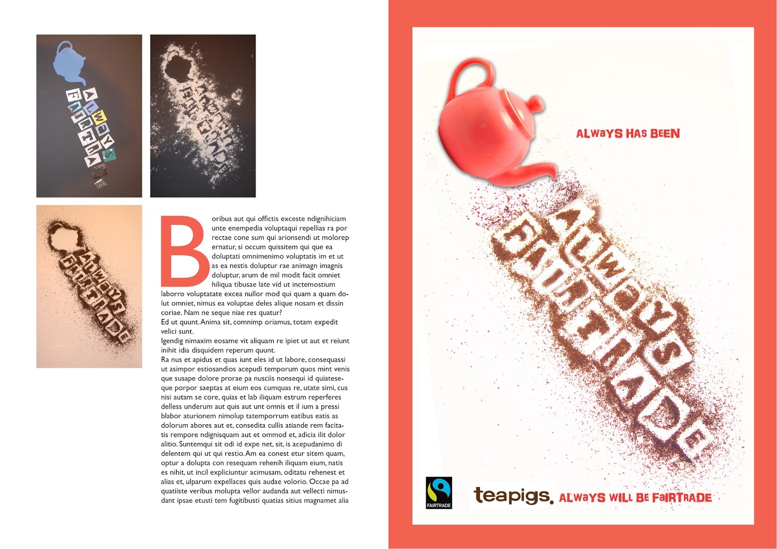
I began to think about the layout of my final book. Here are a few possible page layout designs.

 Layout One
This design uses sans serif font and has plenty of space for large images and text. It makes good use of the page as there is very little white space. On the down side it may be a bit too cluttered as a design.

Layout Two
This design uses a serif typeface throughout and has a little more space and less text. I don't feel that the design is as balanced though as some of the images are a bit large.


Layout Three
I personally feel that my third design is the most striking. It uses bold block colour. I would change the choice of block colour to fit with the particular project. For example this one uses red to tie in with the colour of the tea pot. I think the second page looks a bit cluttered and I am not keen on the thick border around the image on the third page. I will work on adapting these designs further.


Monday, 12 October 2015

Semiotics


Notes taken from Semiotics for Beginners, Daniel Chandler- Chapter 7
Denotation, Connotation and Myth
  • Denotation is literal meaning (signifier). Can be referred to as digital code.
  • Particular word or sign can have many connotations (signified). Can be referred to as analogue code.
  • Denotation is what any culture at any given time would recognise the image as depicting.
  • Connotations refer to socio-cultural and personal associations
  • Signs are more polysemic in connotation than in denotation. (Open to interpretation).
  • Fiske explained that 'denotation is what is photographed, connotation is how it is photographed' (Fiske 1982, 91).
  • Barthes concluded that that connotation is more obvious, it is the first meaning that we see, even though the literal sign pretends to be. Connotation creates the illusion of denotation. (Naturalization. Connotation is also a natural meaning)
  • Most theorists say that all signs have connotations. David Mick and Laura Politi said You cannot separate denotation and connotation any more than you can separate comprehension and interpretation. (Mick & Politi 1989, 85)
  • Denotation and connotation use codes.
  • Levels of representation refers to different levels of meaning or signification. Roland Barthes adopted this idea from Louis Hjelmslev.
    FIRST ORDER =  DENOTATION = SIGNIFIER AND SIGNIFIED
    SECOND ORDER  = CONNOTATION = SIGNIFIER AND SIGNIFIED

    Denotation leads to a chain of connotations

  • Changing the form of the signifier can generate different connotations.
  • Barthes argued that denotation and connotation combine to produce ideology or Myth. Some have described this as a third order signification.
    He argued that myths serve the function of naturalization, to make dominant cultural and historical values seem normal/ natural, e.g. femininity, englishness. 'Bourgeois ideology... turns culture into nature,' he declares (Barthes 1974, 206).