Book Layouts
I began to think about the layout of my final book. Here are a few possible page layout designs.
Layout One
This design uses sans serif font and has plenty of space for large images and text. It makes good use of the page as there is very little white space. On the down side it may be a bit too cluttered as a design.


Layout One
This design uses sans serif font and has plenty of space for large images and text. It makes good use of the page as there is very little white space. On the down side it may be a bit too cluttered as a design.


Layout Two
This design uses a serif typeface throughout and has a little more space and less text. I don't feel that the design is as balanced though as some of the images are a bit large.


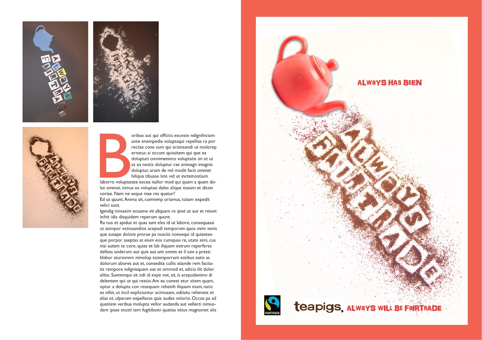
Layout Three
I personally feel that my third design is the most striking. It uses bold block colour. I would change the choice of block colour to fit with the particular project. For example this one uses red to tie in with the colour of the tea pot. I think the second page looks a bit cluttered and I am not keen on the thick border around the image on the third page. I will work on adapting these designs further.

No comments:
Post a Comment