Change for Life Posters
Change for Life is a government initiative to encourage people to live a healthier lifestyle.
The posters have a distinctive design style.
For this mini project I was given the tast of recreating two of the change for life posters using
Calligrams and Pictograms. I decided I would create my own version of the sugar swaps poster using pictograms.
Calligrams and Pictograms. I decided I would create my own version of the sugar swaps poster using pictograms.
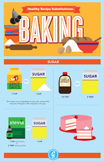
My idea was to use different foods that are similar shapes and join them together, so on one side would be the sugary foods and on the other would be the healthy alternatives. I was inspired by the baking poster below. I really liked the colour scheme.
This was my final Change for Life poster using simple pictogram style images.
I used the pen too to create my illustrations in Illustrator.
I chose to put the logo in the middle as it seemed to balance well.
I chose a chunky bold font to present the information clearly.
I used the pen too to create my illustrations in Illustrator.
I chose to put the logo in the middle as it seemed to balance well.
I chose a chunky bold font to present the information clearly.
Overall I am very pleased with how the poster turned out, especially the use of colour.
For my other Change for Life poster I wanted to use the technique of callagrams to communicate the information. I found this image below from the campaign depicting the recommended calorie intake for an adult. There is not currently a poster with displays this information so I decided to create one.
This is the poster I created. I drew the letters free hand with the pencil tool in Illustrator.
As a finishing touch I decided to use red, orange and green for the plates depicting traffic lights, portraying the the idea of using calories to control our food intake, in the same way traffic lights would control the traffic. I don't feel that the poster is as successful as my other one but it was good to experiment with a different technique for presenting information in an interesting way.
As a finishing touch I decided to use red, orange and green for the plates depicting traffic lights, portraying the the idea of using calories to control our food intake, in the same way traffic lights would control the traffic. I don't feel that the poster is as successful as my other one but it was good to experiment with a different technique for presenting information in an interesting way.


No comments:
Post a Comment