Analysing Infographics
Infographic 1
Source: https://uk.pinterest.com/pin/240309330092782416/

This info graphic grabbed my attention because of the striking large header image.
The infographic aims to show whether London or Paris is the best city in Europe.
The long scrolling layout is easy to follow and the coloured horizontal blocks also make it easy to distinguish between different sections of the information. The fact that the information has been divided into different categories also makes it easier to compare. Similarly, the vertical divide on the page makes it easy to contrast the statistics. The icons are simple and fun to make the information appealing to read.
The infographic also seems relatively unbiased and factual. It contains links at the bottom of the page as references. It also doesn't give the reader an answer as to which city is better, it leaves that to the audience to decide. The topic of this infographic is a subjective one as people will have different views depending on what they consider to be important.
The tone is light-hearted both in content and visually. The colour combinations are complimentary and the simple white font stands out well.
Infographic 2
Source: https://uk.pinterest.com/pin/117023290292186278/

This infographic is about how to create good infographics. An infographic is an appropriate method to communicate this information as it is very relevant to the subject matter. It also make the content more easy to understand with the visual imagery. Like the previous infographic, it follows a similar structure with a divide down the middle comparing good infographic design on one side and bad infographic design on the other. I do feel however that top of the infographic is better than the bottom as the design is more appealing. The colour combinations of this design don't seem to work well, athough perhaps that is intentional. I do feel that the fact that the design is not the most appealing it puts the viewer off reading and makes you think that the author is not knowledgeable about the subject matter. The purpose of the infographic seems to be to promote a particular company at the bottom so the source of this is not an unbiased infographic. The font choice is good and the structure is clean and simple. The tone of the infographic is light-hearted and educational.
Infographic 3
Source: https://uk.pinterest.com/pin/297378381622271271/

Again this is another long scrolling infographic designed for the web. It was created by movehub, a company that provided shopping quotes for people looking to move overseas. The tone of the infographic is serious and factual. It shows the cost of living in different countries around the world. The colour scheme is very attractive and easy on the eye. They have used a minimal palate which works well together. The colours are used to represent the different levels of cost of living and the colour key is consistent throughout the graphic. The infographic portrayed the information in an interesting way using maps to show cost of living around the world. The information is easily comparable. It uses the same sans serif font throughout for clarity and seriousness. The title of the infographic is again very striking and unusual which grabs the audiences attention from the beginning. The layout is clear and systematic.
Infographic 4
Source: https://uk.pinterest.com/pin/554998354054181596/

This infographic is designed to be fun and humorous but also to communicate a serious message about the use of social media and how employers use it to check up on candidates and employees. The humorous tone helps the message to be communicated as it opens the audience up and encourages them to keep reading. It uses a flow charge format which enables the viewer to engage with the information as they follow the arrows and answer the questions. The simple choice of colours are bold and striking. The use of the white background was a good choice as it creates a clean bold design. The white spaces also makes it clear and easy to read. The infographic quotes sources at the end to validate its content. The icons also help to help the readers attention and make this a visually appealing design.
Infographic 5
Source: https://uk.pinterest.com/pin/334392341055540384/
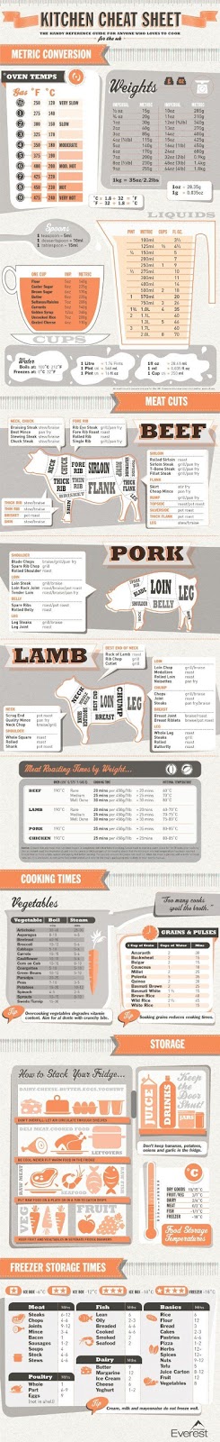
This infographic contains factual information which is presented in a fun way, making it more interesting. It uses very few colours/shades but this helps to give it a consistency throughout. The graphic contains useful information relating to cooking but it is presented in such an appealing way that it is likely to be something that a cook would want to keep and refer back to. It contains simple illustrations which also help the information to presented in a more visual format. It has a retro style which reminds the audience of home cooking.
No comments:
Post a Comment