Wednesday, 25 February 2015

Logo design for a friend
A friend asked me to help her to design a logo and facebook banner for her new company 'Personal Shop and Ship- UK to Malta'. These were some of my initial design ideas.


I was asked to develop the logo further. These were the stages in the process.


Until finally we came up with a logo that my friend was happy with. (Below)


I was given the following photograph to use for the facebook banner that required some editing.


This is the edited facebook banner with a vintage, art deco feel.


Leaflet Design
 
Using the technique we learnt the other day I made this leaflet for a men's event at my church.
I erased some of the text to give the illusion that it was positioned behind the rock.
I also used the eraser tool to removes some parts of the title to make it look like the waves
were splashing on it. I also created a second design with different imagery and fonts.


Alcohol Packaging Research

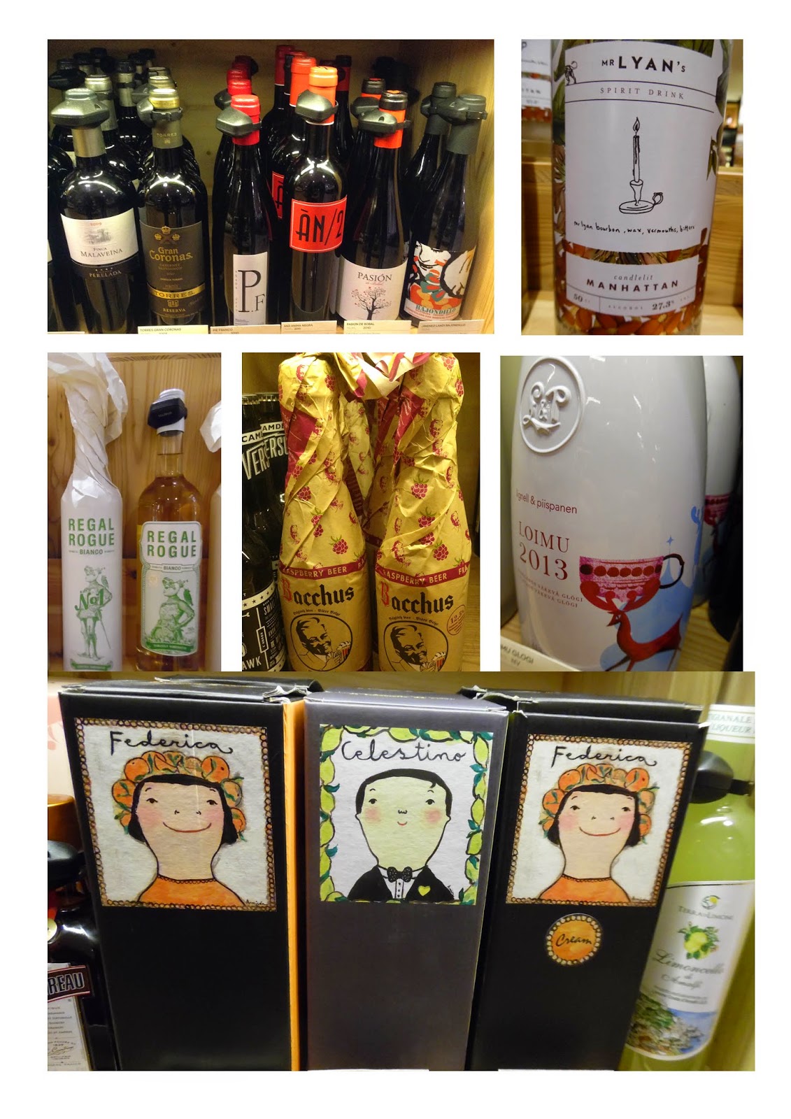
During half term I visited the alcohol department in the Selfridges store in London for inspiration for my project.
These were some of the packaging designs that I liked.

 Most of the wine packaging was simple and classic, often with simple black and white illustrations
on white labels. I particularly liked the torn label on one bottle (top right).  


Some of the wine and champagne were presented in lovely boxes or paper packaging.
I liked the luxurious foil and embossed textures on the boxes.


I noticed that some of the spirit drinks had really decorate attractive designs on the bottles, 
often illustrative in style. For my project, I may create packaging for a spirit.


These images of alcohol bottles were from the internet. I love the bright colours and
also the way the designs work across a range of flavors or varieties.


Monday, 23 February 2015

Metaphoric Type

In today's lesson we looked at metaphoric type. These were my experiments.


I created the typography in Illustrator and then opened it up in Photoshop.
I added an image of the sand as a background layer, used the type as a mask and used the burn tool to burn away some of the background pixels to create the illusion of footprints in the sand. 


Wednesday, 18 February 2015

Logo Design

I was asked to design a logo for 'Lightwater Information for the Vulnerable and Elderly'.
These were my initial sketches and logo ideas. I was asked to create something warm and friendly.


The feedback that I got from the client was that they didn't like the use of an elderly person with a stick on their logo because the organisation appeals to both the vulnerable and elderly. I came up with some more concepts based around the idea of signposting of information. These were the ideas I presented to the client.


My favorite design was the orange one on the left, second from the bottom as I felt it was simple and striking, however the client eventually chose this design as their logo.


Thursday, 12 February 2015

Combining Type and Image

In our lesson we learnt how to incorporate text within images to create interesting designs.
These were the results.


Wednesday, 11 February 2015

Typography Inspiration


I came across this typography on the internet and thought it was really effective.
I would like to try and create something similar.
Pattern Design

At work today I had to create a programme, table name cards and CD cover for a Valentine's dinner event happening at the church this weekend. I created a heart pattern in Illustrator and repeated the pattern across all the various items. 


Thursday, 5 February 2015

Hand Drawn Typography & Image Combined


In our lesson we looked at examples of how image can be combined with hand drawn typography.
I particularly liked the fashion magazine artwork above.


Magazine Cover

We were given the task of recreating a magazine cover of our choice using hand drawn typography.
I chose Vogue magazine, featuring Beyonce on the cover. I chose a vey striking black and white image of Beyonce. I printed it out and used transfer paper to create my typography over the top. Then I scanned the typography back onto my computer and opened it up in photoshop, placing it on top of my chosen photograph. I had to adjust the typography by selecting the inverse and choosing the 'screen' blending mode. 
I then brightened the layer up to make it stand out more. I feel that the outcome is really effective.

Original Vogue cover

My hand drawn typography

My finished Vogue cover with hand drawn typography 


Stefan Sagmeister Inspired Work

In our lesson we looked at the work of graphic designer and typographer, Stefan Sagmeister.
In particular we looked at a piece of work he did where he cut typography into his skin.
The idea is that absolutely anything can become a canvas for typography.
We used fruit as a canvas for our own typography. I chose to write the quote 'Great design is making something memorable and meaningful' on an apple.