Wednesday, 16 March 2016

Maple leaf idea

Post by Clare.

I was able to get my hands on some dried maple leaves and wondered if they could be useful for our project. One of the USPs of Spoon cereal is that it is made with pure maple syrup. I decided to scan the leaves into my computer to see whether they could be used in our design. These are my experiments.


Original Scanned Maple leaves

Photoshop edited leaf


Idea as to how Maple leaf could be incorporated into packaging design.

The leaf colour could be varied depending on the flavour. Although this light green leaf doesn't work as well against the brown paper. I like the texture of the maple leaf.

Experiments using the leaves to create a pattern.


I wondered whether the pattern could be used on the side of the packaging.


 Having created this mock-up I thought that the maple leaf didn't really work as a pattern because it was a bit too fussy, I wondered whether a simpler black and white pattern might work better.


This worked better, however I still feel that the styles aren't working too well together.
The pattern on the side panel is bold and contemporary and the front feels more old-fashioned.
I like the small triangular side panel. 

I will work on some more ideas later.


Tuesday, 2 February 2016

Website research

Website research

I spent some time looking at contemporary website design.
I found this website particularly good.
www.blog.hubspot.com/marketing/best-website-designs-list

I was drawn to the following two websites.
www.mikiyakobayashi.com/projects
www.education.iceandsky.com/

Both of the websites have a lot of dynamic movement when you are navigating around them which I really like. The first website really show cases the work well with a nice photo montage. I like the second website too, which has an unusual illustrative style, and again lots of dynamic movement.


Friday, 29 January 2016

Over the Moon logo

Over the Moon logo concepts

In our group project we decided to all work on logo concepts for 'Over the Moon'.
Here are the logo concepts I came up with.


Logo development


Thursday, 21 January 2016

Kerpow Print Campaign

Images from print campaign

I came across these stock images of children and thought they would be really good for my Kerpow print campaign as they fitted in with the superhero theme. I thought I might use them for my print campaign or website.


Wednesday, 20 January 2016

Website Inspiration for the Kerpow brand

Research for Kerpow's website

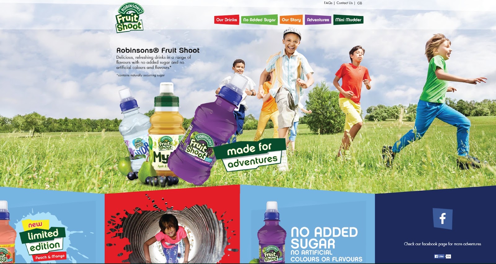
In order to create my website homepage I first researched my competitors websites, Fruit Shoot and Innocent Smoothies.   Both websites were colourful and featured nice photography of the product and also happy faces. I preferred the Innocent website as it had more white space and was cleaner and simpler. I wanted to create a similar simple website.


I also looked at the Cebeebies website which is popular with children. I wanted to create a website that would be fun and appealing for children to use too.
The Cebeebies website has a lots of games and activities on it for children to play. I would like to create a game within my website to attract children to my website.
Inspiration for  a Game

When considering how I might design a game within my website I had a look at other popular children's games, for example Angry Birds. I wanted to look at the style of the graphics within the games. I noticed that the games feature simple illustrations and lots of bold block colour.


Developing brand characters

Brand Character Development

I came up with some names for my superheroes and corresponding drinks flavours;
Thunder Heart - Blueberry and Beetroot
Metal Titan - Pineapple and Parsnip
Invincible slime - Kiwi and Spinach
Hawk Eye - Carrot and Orange
Fire Cat - Strawberry and cucumber

I also looked at existing superhero artwork to get ideas.


I particularly liked the simplicity of the bottom two illustration styles.
I want my illustrations to be friendly and appealing to children.


Here are the superhero characters that I created.


Brand development

Vegetable Drink Research and Development


When considering the direction to go with my brand design I was inspired by this Matey bubble bath packaging. I thought that I could create characters for my packaging that would appeal to children.


These superhero bottle designs also inspired me. I decided that I would design my packaging with a superhero theme.

Ideas and inspiration

I began to research other superhero themed work to get inspiration for my own work.
Here are some that I liked.


I like the use of bold primary colours and typical comic book shapes.
I may also incorporate some dotted patterns in my work too.


Typography Experiments

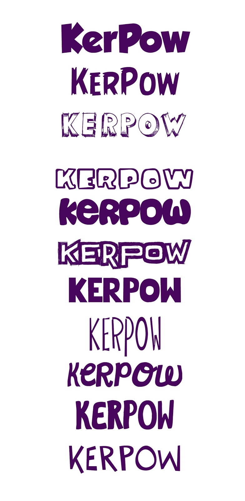
I decided on the name Kerpow for my brand. I chose the name because the word is a phase used in cartoons, meaning 'a powerful sound of impact or transformation; pow, wham.'
It seemed appropriate for a superhero theme.

These are some of the different font options I considered for my logo.

I also experimented with logo variations, fonts, colours, backgrounds, etc.


I was happy with my final purple logo and thought that the logo could also work without the background.


Thursday, 26 November 2015

Book cover inspired by Philippe Apeloig

Phillippe Apeloig

We have been looking at the work of French designer, Phillippe Apeloig.
His strength lies with typography and manipulating typography to create interesting pieces of graphic design. Here are some of his works. His work also features a strong use of grid systems and he is heavily influenced by modernism.


I was asked to create a book cover for 'The Girl in the spider's web' in the style of Phillippe Apeloig, which would also communicate the idea of data and the internet, which is what the book is about.
Here is my design. I like the technique of overlapping and warping typography in Photoshop, however I am not very keen on my colour scheme as I feel that it is a bit bland.


Tuesday, 24 November 2015

Branding Swat Analysis

SWOT Analysis for my brand of healthy drink

STRENGTHS
  • Appealing packaging makes us strand out from our competitors 
  • Marketing plan to target children
  • There is a gap in the market for a product like this, that is healthy and appealing to children
  • The nutritional benefits of my product are easy to market to parents
  • Lower price point than high end competitors (e.g. Innocent)
WEAKNESSES
  • Shorter shelf life of fresh fruit drinks, storage in fridge may be necessary
  • Not able to compete in price with those offering lower quality drinks that don't contain real fruit
  • Having to market the idea that vegetable drinks would taste good
  • Market research was on a small scale so results may not be accurate.
  • My target market is limited to parents
Opportunities

  • Opportunities to partner with other businesses who may stock my product, for example coffee shops and super markets.
  • Government initiates to promote healthy eating among children will help my campaign.
  • My competitors weaknesses, for example the uninspiring packaging design
Threats

  • Threat from Innocent smoothies who have recently launched a vegetable drink.
  • Negative publicity
  • Competitors developing more better packaging for their drinks
  • Competitors, like Fruit Shoot and Capri Sun more affordable to working class parents. them my product

Friday, 20 November 2015

Tone of Voice- Waterstone's Christmas adverts

Waterstone's Christmas Adverts
Tone of voice
In one of our lessons we looked at the concept of 'tone of voice', how images have a tone, which needs to be matched for their use.  For example there are many different images depicting 'Christmas' but their tone many vary. One may have a religious tone, another may have a friendly tone, another may have a childish tone. When designing we need to create the right tone of voice through our use of imagery. 
In our lesson, we were put into groups are asked to select a number of images, some colours and some typefaces that we would use to create a series of Christmas posters for Waterstones.
Our group decided to choose a number of wintery images and backgrounds. Our chosen colours were gold and light blue. We chose three fonts 'hello', 'champagne and limousines' and 'Znikomit'.

I then set about creating some posters and a formal invitation for the Waterstone Christmas party, using only the images that our group selected. These were the designs I created.

I wanted to  create a house style for all the posters. I went for a simplistic approach using the most striking images to pass across a message. The idea behind this campaign is the that of the idea that Waterstone's has a book for everyone at Christmas. This is portrayed by the baubal with the person's name on it and the tree branches, which could represent a family tree. The heart also expresses the idea of giving a gift they will love. I chose to use the words 'Get Christmas Sorted' portraying the idea that getting Christmas presents at Waterstone's is quick and stress-free.
I added a black decorated border to give the posters another dimension and to create a sense of continuity between the posters. The black decorative border also ties in with the colour of the black logo below. 


The next task was to create a formal invitation using the images that we had previously selected as a group.  These were my initial attempts which I was not entirely happy with. I felt that they were too dull and the colours not striking enough.


I then went back to the drawing board and came up with this design which I much preferred. 
I felt that the background image was much more striking and also I felt that the style fitted better with the house style of the posters. I like this final design because it is very simple but the background image is striking and bold. The heavy use of gold is also the right tone for a formal and expensive Christmas party.