Today I began my work experience with a small design agency called Heywood Sener.
www.haywoodsener.com. The firm is made up of a marketing director and a creative director and the company also outsource work to a web designer and other freelancers. One of their regular clients is the Rainbow Play Company. They designed their website and various on-going design projects.
The company asked Heywood Sener to create some promotional material for their upcoming Black Friday Sale. I was asked if I could help with this by designing a couple of tags for the sale day, an A-board poster and also some banners for their website which would be in keeping with the current website design.
Website advert banners
I created these mock-ups in Photoshop to show the client how the banners
would work on the existing website design.
My day went really well and I think my placement were happy with my work.
I learnt a few tips from the creative director, like how to package files for print, how to use google drive, how to 'paste in place' in Illustrator, how to create a swatch group and how to align objects in Illustrator with other another object.
I also observed how the marketing director dealt with clients over the phone. She polite but firm with their requests, was decisive and kept the projects on tract when customers were trying to deviate from what had been agreed, for example in the case of a logo they were working on. These are skills I will need to develop when I am in the position of dealing with clients in the future.
DAY 2 (28th Oct 2015)
On my second day at Heywood Sener they asked me to design some web graphics which would be used in an e-mail campaign that goes out weekly for one of their clients. The client was Gateway Holiday Park (www.caravanparkgower.co.uk) and again they wanted the email graphics to work with their existing branding. The graphics also needed to compliment each other as some of them would be used alongside each other in the email campaigns. The website contained a mixture of photographs and simple flat illustrations and I was asked to do the same. I also chose fonts that have been used before in promotional materials.
These were the web graphics I created.
I was happy with the work I created, with the exception of the new years banner. My employer was happy with the banners and said that the new years one was fine because they only needed to be quick banners and that the client would be fine with these.
Today I spent some time talking to marketing director about the website projects that they have worked on and the process involved. We also discussed pricing and the difference between bespoke websites and websites built using existing templates. She introduced me to the platform 'Joomla' and showed me types of websites they have created using this tool. My employer was happy with my progress today and commented on the fact that I just got on with things by myself and understood what was required of me well.
DAY 3 (29th Oct 2015)
On day 3 of my placement my first task was to make a few minor alterations to the tags and A board poster I put together on day one. I also had to prepare the job for print with crop marks etc. I sent the job off in a print ready format.
I was then given a brief for the work they wanted me to complete for the rest of the day. One of their clients 'Velvet Rooms 4 Hair' wanted a email template designed. The email shot will be created in Mail Chimp, but they wanted a header and various graphics to be designed which would give the email a consistent style every month. The idea is that the client would be able to pick and chose what would go in the email for that particular month. These were the graphics and icons I created to work with the existing colour scheme on their website.
Today I also had a chat with my employer about how they charge their clients.
They have set prices for logo design, business card design, etc. The price includes 3 designs and 1 set of alterations (up to one hour). They also state their hourly rate over and above this. Printing costs are usually on top of this. They also ask for 50% payment up front.
My employer was happy with my work today and spoke to me about working for them part time when the uni placement is over.
Day 4 (10th November 2015)
My first task of the day was to create an A5 leaflet for Rainbow Play Company advertising their Christmas giveaway at Longaches garden centre. Again I was given a very clear guideline as to the style they were looking for, something which would work with the other promotional materials they have. This was the leaflet I came up with. The client asked whether I could add a trampoline image to the design. I also had a go at making the adjustments but I was unable to finish it by the end of the day. I may continue with this another day.
Today I was also asked to come up with some alternative headers for the Velvet Rooms email campaign which I started to work on last week. These were some that I put together.
The final task of the day was to edit a logo design. The company didn't want to change their logo but it needed to be improved. I was asked to come up with some improvements but keep it very similar to the old logo. These were the variations I came up with.
Employer Feedback
Following my first few days of work experience this was the email feedback
I received from my employers.
"From a work point of view you got stuck in and had the knack of picking up on the different clients styles and requirements, which was great. Also the work you produced was spot on, which obviously is great and shows you have a natural flair for design and producing work for others." Emma
"Thank you for coming in and doing some great work :-) Like Emma said we were both really impressed with your ability to get stuck into the jobs, as well as being sensitive to the existing styles of Rainbow, Gateway and VR. Job well done!" Beril
Day 5 - 19th November
Today I received feedback from the client about the flyers I created for the the Christmas Grotto. I was asked to include a picture of a trampoline on the front. They also wanted me to adjust the artwork so that it could be used for an A-Board poster and also in an email campaign.
Here is the work I produced.
I also had to adjust one of the web banners I created before to be used in another email campaign.
Another task I was given today was to update some company business cards with employees new contact details. I had to prepare the artwork so that it could go off to print. No creativity was required of me because the cards had already been designed. I realised that even working in a creative company there are still mundane maintenance tasks that need to be completed for the business to run smoothly and to maintain good customer relations.
In the afternoon I was involved in a brain-storming session with the marketing director. She was going out to meet a client with a marketing proposal as to how to grow their PC repair business.
I shared my ideas and we discussed the direction that their new advert might go.
She would like me to help create a new advert for the company and to design some email campaigns based on the things we discussed. I began working on it but time did not allow me to complete.
I was also briefed on a branding brief that I would be working on next week. I will be designing a logo for a personal trainer. I may start gathering some ideas together before going into work next week.
Day 6 - 24th November
I was given the task of updating some content on some existing artwork. I was having a lot of issues with the links on the files being broken, so I ended up spending most of the morning installing all of the company's files onto google drive on my desktop. It was very frustrating as I felt like I wasn't being very productive. Eventually I swapped computers with Emma and I was able to complete the tasks quickly.
In the afternoon I was asked to create a business flyer for a local IT company. This was the flyer I created. It may need some edits next time I am in.
Day 7 - 10th November
Today I continued with the work I started previously for Keen IT. I was asked to create an image to go in a Christmas email campaign. I was also asked to create images to be used in their regular email campaigns. I spent quite a long time looking through stock images and free image websites to find suitable ones.
Day 8
Today I was asked to create some web graphics for the Body Works website, highlighting the different services they offer. I came up with some format options for the client within the guidelines I was given. I had to use the font given, colour and images.
I was also allowed to start answering the phone at the placement and spoke to one of the clients.
The web graphics were adapted following feedback from the client and the following images were used on the website in a rotating banner.
I was also asked to create some web graphics for another company called 'Mining Maven'
These will be use on Eventbrite to draw attention to different events.
Day 9
Today I was asked to adjust an existing leaflet design to include a section containing 'Easter offers'.
This was the editted leaflet design.
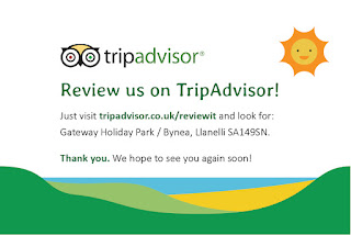
My next task was to create a business card fro Gateway holiday park encouraging customers to review on trip advisor. Haywood Senor help businesses to market themselves better and this was one idea that they had for their client. I came up with two variations, a simple one and a more colourful option. For both of these I followed the company brand guidelines and house style.
Day 10
Today I was asked to create a 'Refer a friend' card for another one of Haywood Senor's clients, Keen IT. Again I had to use the house style of the business.
In the end the client asked that the text on the back be altered. This was the adjusted version of the back.
Today I also had to produce a series of graphs for another company Haywood Senor were working with. Figures were obtained from Yahoo Business and then I used excel to create and format the graphs.
One of the graphs I created in Illustrator and I learnt about working on layers and labelling them correctly so that the graphs could be edited easily in the future by other members of the team.
The other task I was given today was to organise their stock images into different folders making them easy to find for different clients. Haywood Senor buys stock images in bulk and then offers them to clients at reduced prices, selling them as stock bundles to use for various client work.
This saves the company time and money when producing websites and designs for clients.
At the end of the placement, I have been offered a part time job with Haywood Senor working on a freelance basis.


